2.2 Pareto Front
When two outputs both matter but pull in opposite directions, there is rarely a single "best" design — instead, there is a set of designs that each represent a different balance between the two objectives. The Pareto Front identifies exactly that set: the variants where you cannot improve one output without making the other worse. Everything else in your dataset is dominated — at least one Pareto variant outperforms it on both axes — and can be set aside.
When to Use It
Use a Pareto Front when you have two competing outputs and want to find the most efficient trade-offs without manually inspecting every variant. For example: minimising slope while also minimising total walking distance, reducing carbon while maintaining structural performance, or minimising cost while maximising usable area.
What It Shows
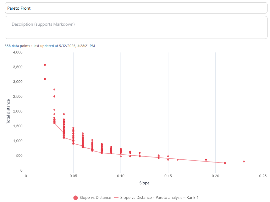
The Pareto front is drawn as a line through the boundary of the point cloud — connecting the variants where no other design is better on both axes simultaneously.
What to look for:
- Variants on the front are the most efficient trade-offs — to improve one objective you must accept a worse value on the other.
- Variants far from the front are dominated: at least one Pareto variant beats them on both objectives, making them less interesting.
- A steep front means the trade-off is sharp — small gains in one objective cost a lot in the other.
- A gradual front means trade-offs are more flexible and you have room to shift between objectives without a large penalty.
Adding a Pareto Front
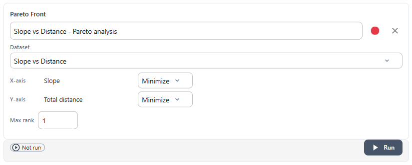
In the Analyses tab of any scatter chart, select Pareto Front from the New analysis dropdown and click + Add analysis. Make sure your scatter chart has both axes set to outputs — Pareto analysis compares output-to-output trade-offs.
Configuring the Settings
Each Pareto analysis has the following settings:
Name — a label for this analysis, shown in the chart legend.
Dataset — select the dataset to run the Pareto analysis on. The dataset should contain two output variables, one on each axis.
X-axis / Y-axis direction — for each axis, choose whether you want to Minimise or Maximise that output. This tells the Pareto algorithm which direction is "better". For example, if both slope and total distance should be as low as possible, set both to Minimise.
Max rank — controls how many Pareto layers to display:
- Rank 1 shows only the true Pareto front — the single best layer of non-dominated variants.
- Rank 2 adds the next-best layer: variants that would be on the Pareto front if all Rank 1 variants were removed.
- Higher ranks continue this peeling process, each revealing the next tier of trade-offs.
Use multiple ranks to understand how quickly performance drops off as you move away from the optimal front, or to give yourself a larger shortlist of candidates.
Result
The Pareto front is drawn as a line connecting the non-dominated variants. Points on the front are the candidates worth investigating further.
Tips
- Variants on the Pareto front are strong candidates for saving as presets and comparing in the Compare section.
- Add filters in the Data tab to generate a Pareto front for a specific subset — for example, only one structural system type — and compare it against the full dataset to see whether the trade-off shifts.
- Combine a Pareto front with a regression line on the same chart to see both the trade-off boundary and the overall data trend.
- Use Rank 2 or 3 if Rank 1 gives you too few variants to choose from, or if you want to understand how sensitive the front is to small changes in input values.
Next: 3. Mean Bars