4. Sensitivity Graph
The Sensitivity Graph shows which input parameters have the greatest influence on your outputs — expressed as a percentage contribution to the variation in each target.
It uses SHAP (SHapley Additive exPlanations) — a method from machine learning that explains how much each input contributes to a model's predictions. Under the hood, InForm trains a decision tree as a surrogate model of your Grasshopper script, then uses SHAP to attribute the output variation across all computed variants back to each input. The result is a set of importance scores that sum to 100%, telling you exactly how much each input is responsible for what you see in the outputs.
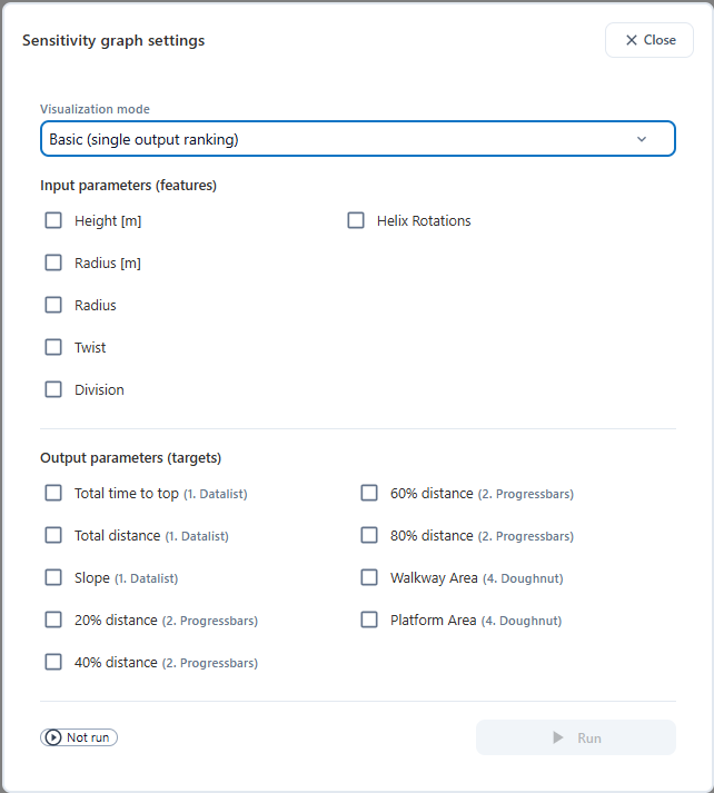
Click Add sensitivity graph to add one to the page, then adjust the settings to configure it.
Configuring the Analysis
There are two visualization modes (discussed in detail below):

After setting the visualization mode, select the input parameters and output targets you want to include. InForm will run a SHAP analysis for each selected output against all selected inputs.
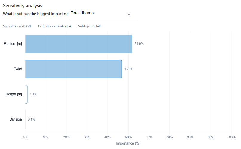
Basic (Single Output Ranking)
Displays a horizontal bar chart ranking all selected inputs by their percentage contribution to a single output. Use the dropdown in the chart header to switch between different target outputs.
This is the clearest way to answer the question: which input has the biggest impact on this output?
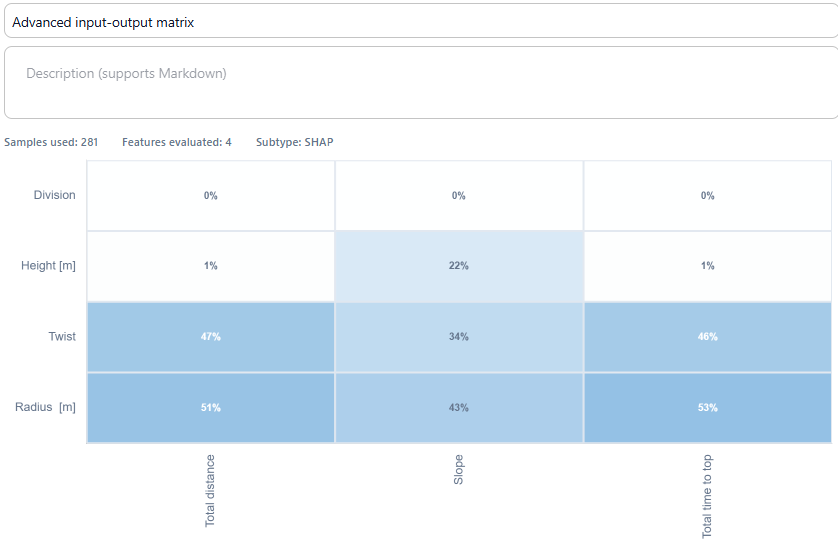
Advanced (Input-Output Matrix)
Displays a heatmap matrix with inputs on the rows and outputs on the columns. Each cell shows the percentage contribution of that input to that output. Darker cells indicate stronger influence.
This mode lets you compare sensitivity across multiple outputs at once — useful when you want to understand how inputs relate to several competing objectives simultaneously.
What to Look For
- Inputs with a high percentage are the main drivers of that output — small changes to these will have a large effect on outcomes.
- Inputs with a low percentage have little influence and can often be deprioritised when optimising for that output.
- If one input dominates across all outputs, your design is primarily controlled by that parameter — consider whether its range in the parameter space is appropriate.
- In the matrix view, look for inputs that score high on one output but low on another — these are levers you can use to target specific objectives without disrupting others.
Tips
- Run the sensitivity analysis for all your key outputs together using the Advanced view to get a full picture before diving into scatter charts.
- Use the results to simplify your design space — inputs with consistently low sensitivity across all outputs can often be fixed at a single value.
- Combine with the scatter chart to understand not just which input matters, but how it affects the output and whether the relationship is linear or non-linear.
- SHAP results depend on the quality and spread of your parameter space — the more variants computed and the more evenly the inputs are sampled, the more reliable the scores.
By now you have explored the full Trends toolkit: scatter charts to map relationships, regression and Pareto to find trends and trade-offs, mean bars to compare categories, and sensitivity analysis to identify what actually drives performance. You have a clear picture of which parts of the design space are worth pursuing.
The next step is to move from analysis to decision-making. Head to Compare Variants to save your most promising designs as presets and place them side by side to find your best option.