2.1 Regression
A Regression analysis draws a trend line through the data points on a scatter chart, showing how one variable changes as another increases or decreases.
Regression Types
InForm Trends supports three regression types, each suited to different kinds of relationships in your design data.
Linear
A straight line fitted to the data. Linear regression assumes a constant rate of change between the two variables — as X increases by one unit, Y changes by a fixed amount. It is the simplest model and gives an immediately readable summary of the overall direction of the relationship.
Use it when the scatter plot suggests a roughly straight trend, or as a baseline before trying more flexible models.
Polynomial
A curved line that can follow bends in the data. Unlike linear regression, polynomial regression captures relationships that change rate — for example, an output that rises quickly at first and then levels off. The degree of the polynomial (how many bends it can make) is determined automatically based on the data, so you do not need to configure it manually.
Use it when the relationship is clearly curved but follows a smooth, monotonic pattern.
GAM (Generalised Additive Model)
A GAM fits a smooth, flexible curve that can adapt to more complex patterns in the data. Rather than assuming a specific shape upfront, the model learns the shape from the data itself. This makes GAM well suited to parametric design outputs, where relationships between inputs and outputs are often non-linear and not easily described by a simple formula.
GAM typically produces the most faithful representation of the data trend, but is also the most sensitive to sparse regions in the dataset.
For readers interested in a deeper understanding of generalised additive models, the following resources provide useful background:
- Baayen & Linke (2020): https://quantling.org/~hbaayen/publications/BaayenLinke2020.pdf
- Practical tutorial: https://m-clark.github.io/generalized-additive-models/introduction.html
Adding a Regression
Regression analyses are added via the Analyses tab in the Graph Settings of any scatter chart.
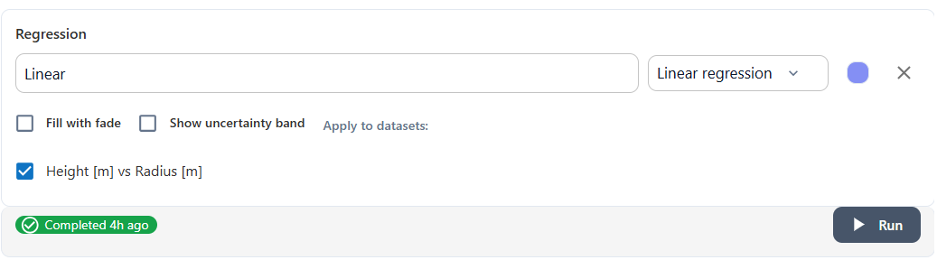
For each regression you add, you can configure:
- Title — a label for this regression line, shown in the chart legend.
- Regression type — choose between Linear, Polynomial, and GAM from the dropdown.
- Dataset — select which dataset the regression is applied to. This is useful when the chart contains multiple datasets and you want separate trend lines for each.
- Colour — click the colour swatch to change the line colour.
Uncertainty Band
Enable Show uncertainty band to display a shaded region around the regression line.
This band represents the prediction interval, showing the expected range of outcomes for individual data points at each value on the x-axis. It reflects the spread of results in the dataset, rather than the uncertainty in the fitted curve itself.
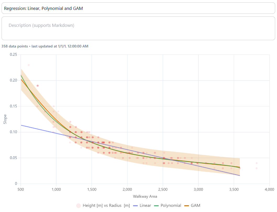
Click the band colour option next to the regression entry to change both the colour and the opacity of the uncertainty band. Reducing the opacity is useful when multiple regressions are shown on the same chart.
Running the Analysis
Once you have selected your dataset and regression type, click Run. InForm Trends will compute the regression and update the chart. The status indicator below the settings panel confirms when the analysis has completed.
Tips
- Start with GAM to see the true shape of the relationship, then compare it with Linear to judge whether a simpler model loses meaningful detail.
- Add regression lines to multiple datasets on the same chart to compare how the trend differs between subsets — for example, one structural system versus another.
- Use the prediction band to judge whether the spread of outcomes is acceptable across the target input range. A wide band means real design variability is high, not just fitting uncertainty.
- If the prediction band is very wide, other inputs not shown on this axis are likely contributing significantly — investigate further with the Sensitivity Graph.
- Combine with filters in the Data tab to check whether the trend holds within a specific subset of the data. If it changes, add a filtered dataset with its own regression to make the difference visible.
- Use regression before sensitivity analysis to build intuition about which input–output relationships are worth investigating further.
Next: 2.2 Pareto Front